Improving the Homepage

What’s wrong with the homepage? :thinking:

Right now we have lots of Amazing projects and so many nice things happening every month but we don’t reflect them on our homepage very well.
Each time a user visits our homepage it’s mostly the same and it’s not alive as it should be!
Also, we don’t have a proper space on the Homepage to share the Giveth news and let people know about the new changes.

What it should do? :zap:

As one of the most important landing pages on Giveth, we have to encourage people to donate to projects or create a project and participate in the Giveeconomy. Still, the Homepage should be straightforward and intuitive enough to turn visitors into Givers.

The solution :gift:

With the new homepage, we are trying to give users a path to walk!

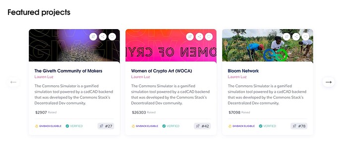
  1. The Featured project
    the first thing we need to present is the important projects which have the most impact on the public, these projects should be chosen by the coms team every two weeks to be presented on the homepage.
  • Why every two weeks? to keep the first shelf always polished and fresh!


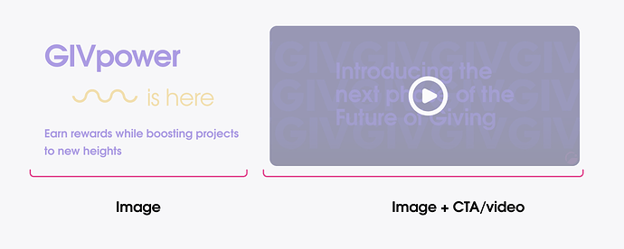
  1. Why giveth?
    Okay, now I see some good projects, what’s in it for me as a donor or someone who have a project?
    Here we need to give users some answers! but it won’t need to be something really big because after a while it will be annoying for users to see it each time they visit Giveth!

  1. What’s up with Giveth!
    When we release an important feature or something happening on our platform we should reflect that on the homepage too.


  1. Prove it!
    We have to give users some information so they know the Giveth is alive and they can believe in it!

    Here we present the overall information about the # of projects and donations and also to make it clear to the users we can show the recent donations happening on the Giveth.

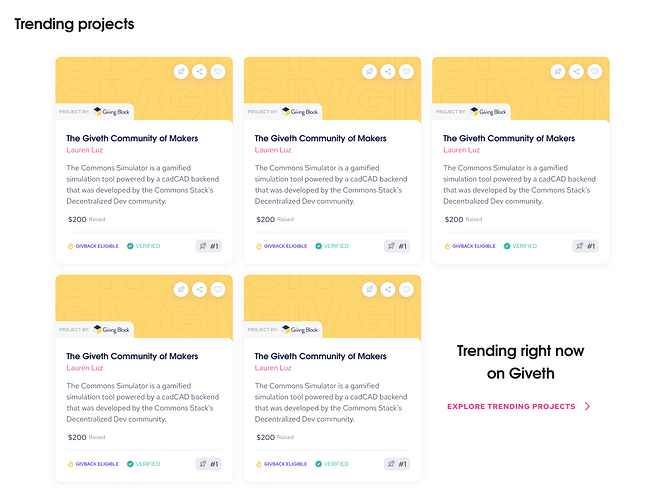
  1. Trending projects
    Okay, I saw some statistics and I saw the featured projects before, I’d like to see more projects!


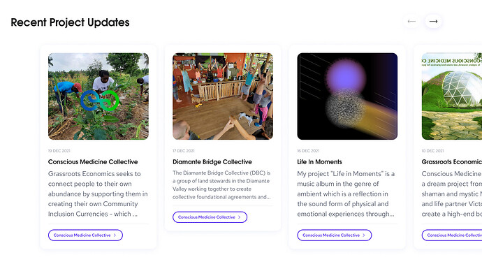
  1. Recent project updates
    Continuing from the previous section, “Trending projects”, here we present the recent updates from the projects on Giveth based on the impact they have and popularity.

This section will help us to show visitors, that the projects on Giveth are active and they are reaching their goals, so the potential project creator can be more encouraged to start building a project.


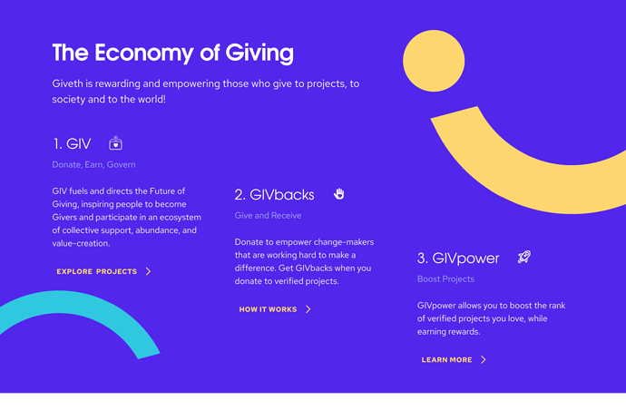
  1. The economy of giving
    When visitors get to this part of the homepage, we introduced enough of the projects, now we need to let them know about another amazing benefit of the Giveth.

We also have to make it possible for the visitors to learn more about each part of the economy and learn how it works!
So for each part of the Giveconomy, we have to create a landing page so they can read and learn more.


  1. Ready to get started?
    As a potential project creator, first I’d like to scan the whole page, so after I saw so many projects I’ll get to here and now we can ask them to create a project or even if they are not sure yet we can give them more reason in another page to create a project.


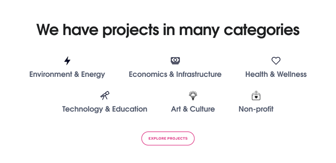
  1. Project categories
    Here for those curious visitors, we can show all of the project categories that we are supporting to make it clear how big Giveth becomes!


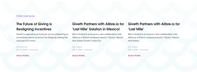
  1. From our blog
    Here we can show the latest posts from our blog.


  1. Newsletter
    Get the latest updates!


That’s it

Well done you almost reach the end :grin:
So here I’ll let you see the new and improved homepage as a whole to have the full picture!
If you need to get into more details, you can find the finished design on Figma → [Link to Figma]

Please

Share your feedback and comment and let us know what you think about it!

Thanks :purple_heart:

(https://www.figma.com/file/nVoinu0tgJ565enN5R4WDE/Giveth.io-%26-GIVeconomy?node-id=16232%3A298734&t=BFi7mah1DdYJSDSG-4)

10 Likes

Is this considered to be final design or serves as a wireframe for now?

1 Like

It’s not a wireframe, but it’s still not final, there are still some aspects that can be improved!
Like how we should present the project.
Also the priority for showing each section.

2 Likes

Wow!!! This is amazing!!!

I’m very excited to see all these things get implemented into the homepage.

For point 4 (prove it). It would be amazing if some of the stats could be moving… that is always exciting like in (https://www.worldometers.info/). Maybe if we have an average donation every 8 hours, if it’s not to hard that a 100 USD donation increase as a ramp in 8 hours till the full 100 USD is reflected.

I also think that we are missing an “about” page. For those curious visitors that got here… gods know how. & they are understanding really half of everything and they do want to know more of how the project started, whats the vision, mission, values, team, milestones (reached and coming), etc. This might be outside of the scope of the Homepage improvement but I think we really need it.

Anyways, this is fantastic work! Congrats @msaeedi

3 Likes

Really excited to see this topic in action, thanks for putting this together!

I have a few thoughts around this so here’s some feedback on my first gut impression when I look at this:

  • When I direct newcomers to the homepage, they are likely wondering who Giveth is and how it works. So the #2 “Why Giveth” section makes sense close to the top - but I think we could benefit a lot from having a background for that section which stands out (maybe blue) with a clean look like #7 The Economy of Giving. We could eliminate the shadow boxes for example. At the moment it feels a bit cluttered positioned between the Featured Projects & Trending Projects, because have the Featured Projects boxes, then the Why Giveth boxes, then the video box, then the Trending Project boxes. It’s a lot of boxes and similar background color in the first 6 sections :slight_smile:

  • I’m kind of wanting the #4 “Prove it” to be higher, as #3. If I am new to Giveth, I think it’s a great impression to see clear points of why giveth is the way to go, followed immediately by numbers validating our platform’s activity before seeing features. The feature highlight around GIVpower could then follow right after, but it’s not a deal breaker because I also understand the need to feature new launches.

  • The Trending Projects and Recent Project Updates sections are cool for sure. But that’s a lot to scroll through. I am wondering, do we really need 3 project sections on the home page, or is this something we could instead feature on the main Projects Page? I could see having a second section somewhere further down directing visitors again to the projects once they’ve scrolled a bit, but 3 entire sections feels like a lot because… :point_down:

  • We want visitors to reach the Economy of Giving section - maybe sooner? In my opinion this is part 2 of the “Why Giveth” question that we want to answer for new visitors. I really really like the clean design of this section by the way, as well as the rest of the sections below it!

  • Lastly, could we have a banner for communications campaigns that ties in together with the Featured Projects - so it’s clear why they are being featured? Maybe just above the project boxes there is room for a couple taglines, and the background of that whole section can be altered. We’ll want to help projects raise funds to support specific current events, causes, holidays, etc (Climate Week, Holiday Giving Season, Ukraine, etc).

Super cool to see this coming along, amazing job @msaeedi

4 Likes

Thanks @Cotabe for your feedback!

I’m making some changes to the Prove it section a little.

We have the about us page on the footer. I don’t think we should put all of that information on the About page, instead, the whole platform should communicate them with users.

2 Likes

Thanks @Cori for your feedback!

I made some changes to the homepage and made a prototype

Please take a look here:

I made some changes and now they are a little bit shorter now!
I know it may seem a lot, but I’d like to present the most influential projects to users, even before going to the projects screen, we can use the Homepage to cover those projects and create a fresh vibe, right now

We can move that section a little to the top.

Yes, It’s a good idea! Can you think of a good tagline?

3 Likes

Cross-posting my comment here from Discord:

I would love to see the banners for new features and updates become a bit more dynamic - specifically in the section for GIVpower and right now currently how we show GIVpower/$nice token banners

We’re constantly adding new features and products so how can we have a good way of showing people the latest stuff - front and center on the homepage. Right now the blockers is that if we have 2-3 things we want to show people it can get pretty messy and easy to miss

For example many video game launcher applications have banners that slide showing latest news, patches and added features to keep users aware and engaged

4 Likes

Hey @msaeedi - Thanks for putting this together. Just talked about it some more with @Cori - I think that having the projects repeat 3x on the page (featured, trending & then updates)… might be a little too much.

We could instead focus on the message and why Giveth. Give them info on the stats, on the GIVeconomy, on Giveth features… and then show the projects somewhere - but only once.

Take a look at gitcoin’s page for example… They don’t show any of the grants, but they do explain exactly what Gitcoin is.

2 Likes

I see your point, I think we can do something on that regard to promote more of GIVeconomy but also We need to let people know about the projects on Giveth to get them to donate.
Think of it as a returning user, he/she already learned about why giveth and all its benefits, so what else we can offer?
For example, the reason behind adding the Recent update row to show the project update is to communicate with users that our project is alive and working or having the Featured and Trending row we can show the most popular project to users and help them to get more donation!

I love the Gitcoin, and I sure take a lot of help from it, but it’s more focused on the builders and developers in the web3 space, we are not like bitcoin and we have a lot of projects on so many different categories.

I think we have to be more balanced in showing the reason to use the Giveth and also showing the projects on the platform.

We can discuss this to find a balance to achieve both I guess!

@Cori @karmaticacid

2 Likes

Hey @msaeedi thanks for the prototype video! Interesting with the boxes moved to the top. But I’m really wondering how we can make the page less busy still.

Gitcoin was perhaps not the best example, fair. But looking at the brand new website from Gaia Gives or the older, very well-known GoFundMe might better illustrate what I mean. These pages focus mainly on communicating their unique selling points, while making it easy of course for users to navigate to the projects or start their own.

New users landing on our homepage want to know who we are and why they should donate with US. There are so many donation platforms out there. What makes us different, why donate through Giveth and not someone else? Why support what we are building? The homepage is important for us to gain new users of Giveth, just as much as the individual projects use their pages to gain donors. I think answering these questions is more powerful than showing projects many different ways, so if we’re talking about keeping the homepage clean and simple I would reduce the project sections to 2 maximum.

The homepage should largely speak to our unique selling points (GIVeconomy rewards, zero fees, ease of use) and feature testimonials (how about our biggest donors, Gnosis?) and stats (I like the stats banner you have there, for this reason) to show credibility. Then people understand why we are different, and that they can trust us.

A featured project section at the top also makes sense - this is where we give people a window into the projects on Giveth, making it clear immediately what we offer and also encouraging them to donate like you said (once they understand why they should do it through us). There is also where return users will quickly see what’s recent, and they’ll navigate there right away because it’s what they always do.

We can then also have one dynamic scrolling banner (great idea @mitch ) to feature various product & comms news. All of it could be clickable to other landing pages associated with that campaign or that launch.

Also, regarding the Recent Project Updates section - why don’t we position this at the top of the Projects page? This would still entice projects to do regular updates for better visibility and also show that our website is active once users navigate to check out the projects.

That’s a lot of thoughts :sweat_smile:, hope I’ve communicated them clearly

4 Likes

Thank to Lauren for sharing this with me. I think it’s important to put yourself in the mindset of the consumer (or in this case, donator).

So I’ve thought about what question’s I’d be asking as in that position.

  1. What make me want to use Giveth compared to other donation platforms?

When I look at this page design it’s not talking to me.

It starts with a command, and a benefit I don’t care too much about.

How about this:

We run a poll on giveth twitter and in Giveth Discord (and wherever communities are for Giveth):

Ask –

What benefit first attracted you to Giveth?
Zero fees
GIVbacks
Easy onboarding

And then we truly know which pain point people care about and gets them to donate.

  1. How can I trust Giveth?

Ask any top marketer and they’ll say video testimonials are the best way to build social proof.

We could pick a person who’s the exact target audience for this page (e.g. Someone completely new to Web3 and Giveth onboarded)

They answer these questions with this in the same order (but don’t actually say the questions):

Part 1

What were your biggest struggles and pain points before using Giveth? (e.g. they didn’t trust charities, they didn’t like having to sacrifice money for a cause, etc.)
And
What was the turning point or moment that caused you to join? (e.g. I saw I could get rewarded for supporting social good projects)

Part 2

What was the big benefit you got from using Giveth?

Get them to share a clear ROI.

“I donated $1000 and received $1000 worth of $GIV token which I then used to donate onto other projects”

"Giveth walked me through all the steps needed to use crypto within a day, making is so easy for someone like me who’s never used crypto before. ”

“I donated to (social project) and saw the money being used to (result)”

Part 3

What was it like using Giveth? (short part)

This is where they share how awesome Giveth is.

Limit the time they spend on this. It’s a “nice to have”. Not a necessity.

Part 4

Get them to share an optional call to action.

“If you want to donate to social good projects, I recommend using Giveth.”

  1. Hmm, so where do I donate?

I see a little sub heading with a command of ‘donate crypto’ but no button/link with a clear CTA, just ‘check out projects’ – I think having the button/link saying ‘donate here’ or ‘donate now’ would be more effective, you’ll see gaia.gives do this

There are links to check out projects and there’s a link to create a project.

  1. Okay so Giveth ‘verifies’ projects. What does that mean?

I think a clear explanation somewhere (maybe in Video with Griff?) to explain exactly what kind of projects we verify and which types of projects we don’t accept.

That way we’re creating a clear criteria donators understand, building trust.

In summary, the questions as a new audience I’d ask:

  1. What make me want to use Giveth compared to other donation platforms?
  2. How can I trust Giveth?
  3. Hmm, so where do I donate?
  4. Okay so Giveth ‘verifies’ projects. What does that mean?

I hope this helps.

5 Likes

Thanks, @Cori for the fantastic feedback! I would like to have a quick conversation with you to get your feedback on the changes I’m making to the new homepage. I’ll reach out to you on Discord.

2 Likes

Thanks, @Stee for the feedback! it’s beneficial to have this feedback to improve the Giveth. I’m making some new changes to the design and I’m trying to reflect all your points there, I’ll release the new design soon and I appreciate it if you could keep this forum under your radar to share your feedback again on the new version.

2 Likes

I love the idea of the Giveth Twitter polls and will set something up this week, see if we can get some feedback that we can use in design @msaeedi

We could also create a short typeform user survey and email it out to get some feedback.

I honestly think that it would be valuable to take a week to survey our audiences before e finalize the design.

Also though… we did send out survey’s like this before - did we get any conclusive info? Before I do double work. @Tossynee @clara_gr @JakeS ?

1 Like

Thanks for asking @karmaticacid and @Stee you bring up great points and questions, but some good news is we have asked some of these questions recently from our “currently donating” and “not currently donating” to Giveth. Here are the compiled answers from that survey in a nice, clean Miro board

Giveth Donor Personas, Online Whiteboard for Visual Collaboration (miro.com)

Here you can get a clear idea of what people are saying about Giveth. I still like the idea of a twitter poll, but hopefully using this Miro, the twitter poll can be used to assist what we already know about the donors.

@clara_gr is currently finalizing a survey from the projects side, so more info will be available to us in the coming months from that perspective

1 Like

Thanks, @JakeS for the Miro link, It’s helpful to read them.
@karmaticacid , I like the Twitter poll idea too, so we can get some results fast and then we can think of the main questions to answer for the Typeform.

1 Like

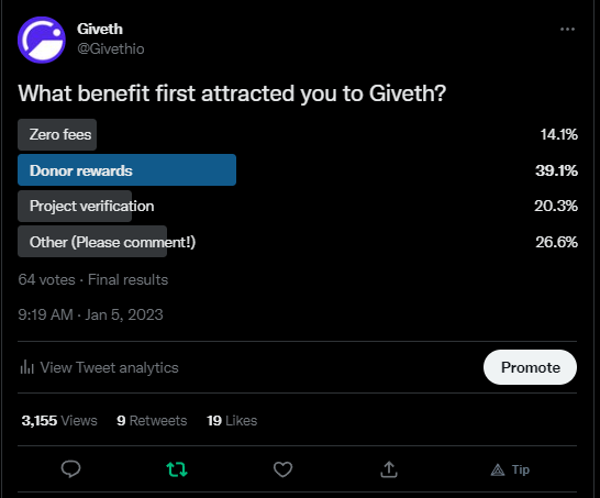
I made a quick poll: https://twitter.com/Givethio/status/1611004456262422528

Got lots of votes in the poll on Twitter - 64 total.

Really interesting resuls… the primary attraction to Giveth was in fact GIVbacks - donors rewards.

image

A lot of people also voted for “other” where the comments include things like:

  • The community, people & vibes
  • Radical anarchist values
  • Regen Economies
  • Making cryptogiving easy & attractive
  • Impact tracking
  • Outstanding projects

“Zero fees” was the least interesting option for people.

@msaeedi - do you want to talk about how to weave these results into the homepage design? Or can you have a look and start thinking about it?

Some ideas I think we can run with:

  • Write something about our vision - making public goods funding regerative, transforming it with web3 tech (regen economies, not our vision statement)
  • Build resources for newbies, have a link in the homepage like “new to crypto? start here.” We have already the project owners & donor 101 youtube video courses that we can use for this.
  • Make sure to include good stats about types of projects, number of projects, explain project verification and our process for ensuring high quality projects.

I’m happy to have a brainstorm sesh together to build on this if it would help.

4 Likes

+1 on the “new to crypto” or “Start Here” section. I want to have an easy place to send my family and friends!

2 Likes