Design WG proposal
Problem
Currently, we’re using Marko’s personal Figma workspace who has been paying for the Figma Professional account for all contributors who have been given edit permissions. Payment is less of a problem because it can be reimbursed (if asked for), but design files organization and scaling the Giveth Design system is a problem.
Here are are several other problems we’re facing with the existing Figma account structure:
- Lack of a good structure
- Hard for developers to find the right components
- Ineffective handover process
- Designers (especially new joiners) can’t use or update the design system easily
- Files becoming heavy causing performance issues in Figma
- Inability to use Figma Team features such as Libraries (important for Design system management)
- Team wide access is restricted due to currently used personal account from our team member
Design Workflow problems
Right now, we have two files:
- one file for all of the Giveth designs which we call “Giveth.io & GIVeconomy”
- and another file for the whole design system which is called the “Giveth design system v0.1”
When we need to work on a new feature we jump into the main file and start adding the design, when they are done, we start adding the responsive guides.
If we need to make a prototype we should find a clean place to start prototyping!
It’s also getting bigger which can cause slow performance and take more time to do just simple things.
If devs or stakeholders need to find something in this mess, they have to ask one of the designers where they could find something because it’s getting complex by the day and it’s not easy for someone who doesn’t know around to find the way!
Design Handover problems
Another problem is happening around handing over the design to the developers!
What is the problem? Well, they can’t find them easily, and also even with so many hints they happen to do something wrong and in the end, they have to do it again to comply with the designs.
Performance problems
The design system is getting bigger which is good, but the file size is getting bigger too and it will need more system memory to load the file and be able to work smoothly! We need a better structure to be more scalable and still keep the file size small.
Solution
We need a better and cleaner structure to make it possible to scale things without making them slower, messier, and harder for everyone to use it.
In order to achieve this goal, we need to break down the main file into smaller files (which are called Core files) based on each feature and then put the design for each feature in those files.
Then, in each file, we can use pages to organize all of the designs for that feature.
Also, when we start working on a new design, we will start working on the “Working file” which contains everything from the ideation to the final design! when the design is ready to hand over, it should be moved to the core files.
Smaller files mean it takes much less memory to load them and since we have a more focused and clear structure on each file, anyone can find anything easier and faster without distraction.
Take a look here for the structure overview!
Also, you can find the suggested file structure below.
Team overview
How the design workspace on Figma will look like.
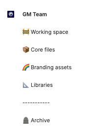
Working file: Contain all of the files that we are currently working on.
Core files: When a design is approved, we moved them to core files. This is where devs can find the final designs.
Branding assets: all graphical assets and brand-related should be found here.
Libraries: Design system files.
Archive: Contain archived files.
Design system structure
We can even separate our design system to make it smaller so devs and designers can open it much easier.
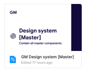
Design system [Master]: contain only the base components.
Design system [Variants]: Contain all variants that built on top of the base components.
Design system [Styles]: All style of the components based on variants,
Important: This is the only place that developers need to look at to find design system assets.
Core files structure
Core files contain all of the approved designs for each feature.
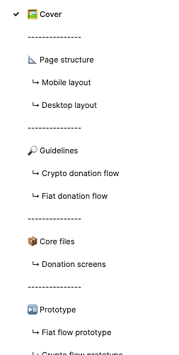
Page structure: contain all responsive guides and also the explanation of page elements
Guidelines: contain all flows so anyone can look at the flow to understand the relation between pages and elements
Core files: Design of all the pages and related assets.
Prototype: when we need a prototype we can add it here to keep the core file clear.
Sandbox: contain archived elements.
Working files structure
Contain all of the files that we are currently working on.
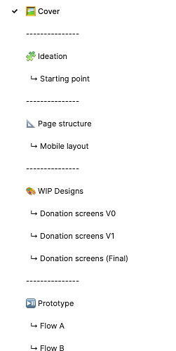
Ideation: All ideas and testing will be here.
Page structure: Contains all of the responsive guides & design structure.
WIP files: All designed pages stored in this section
Prototype: When we need a prototype we can add it here to keep the core file clear.
Sandbox: contain archived elements.
Proposal
Purchase the Professional plan for Figma in order to be able to have a more optimized structure and solve all aforementioned problems.
Why?
On the existing Free plan, we can’t create a Team, so we can’t have a shared workspace on Figma. If we want to break the files into smaller files we need to have the Premium account, then we can have a team and all team members (including designers, devs, and stakeholders) have access to any file that we put in the team.
How much is the Professional plan?
If we pay annually we can get a discount and pay $12 per editor/month or
$ 15 per editor/month (In case we pay month to month!)
Note: Devs and stakeholders are just viewers and they are all free to view and inspect files.
Funding proposal
Right now we have 4 designers that are working on Giveth, so it would be $ 48/month which means $576/per year.
Note: If we add more editor roles (designers) in the future, the price would increase respectively.
We’re open to hearing suggestions on how to proceed with ownership, billing, and reimbursement if the proposal passes.
Thank you.
