This forum is a complementary post for this proposal → Improving single project screen
In this forum post, we want to share some exciting improvements to the project detail view for project owners.
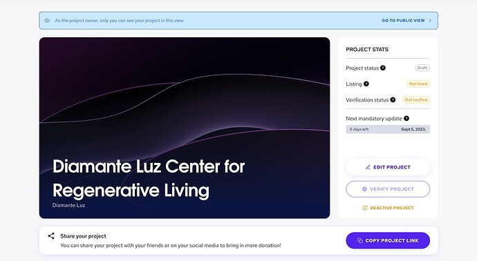
Currently, when project owners access their project detail screen, they see a view that is almost identical to the public view. However, we realize that there is a lot of important information that project owners need to see, such as project status, listing status, and verification status. We’ve also received feedback about the user experience of writing a new update.
Additionally, we have recognized that there has been a lack of communication with project owners about how their project is performing. Previously, there was no complete overview of the project, which caused confusion and frustration for some users.
We have also received feedback regarding the user experience of writing a new update, which has caused frustration for some users.
To address these issues, we’re not just adding new features to the current layout. Instead, we’re creating a better structure and improving the user experience for project owners.
Showing all project status
In the redesigned layout, we aimed to consolidate all the different project statuses into one space, making it easier for project owners to stay up-to-date on their project’s status. Our goal was to enhance the user experience and provide project owners with a clear understanding of their project’s status.
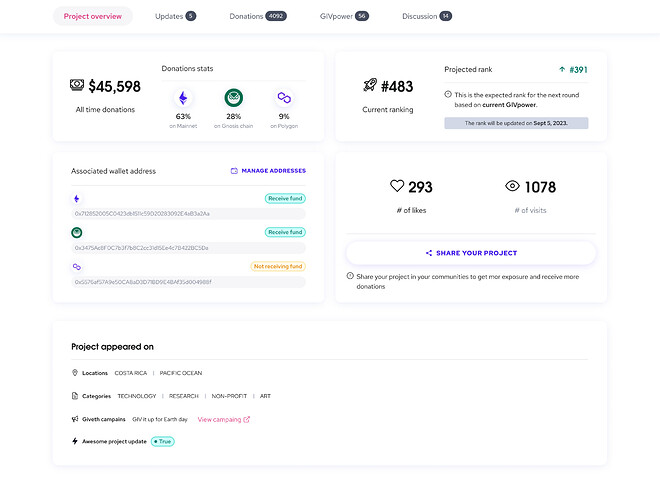
Project Overview
We’re excited to announce the upcoming launch of our new project overview tab! This new feature is designed to give project owners a complete view of their project’s performance. With this tab, project owners can easily access all the information they need, including the amount of donations they’ve received, their Givpower ranking, number of likes, views, and much more.
Additionally, project owners can view all the wallet addresses associated with their project, as well as the categories and locations where their project is being presented. They can also see if their project is part of any Giveth campaigns and if their project updates are featured on the Giveth homepage.
We believe that this new tab will significantly enhance the user experience for project owners and help them stay up-to-date on the performance of their projects.
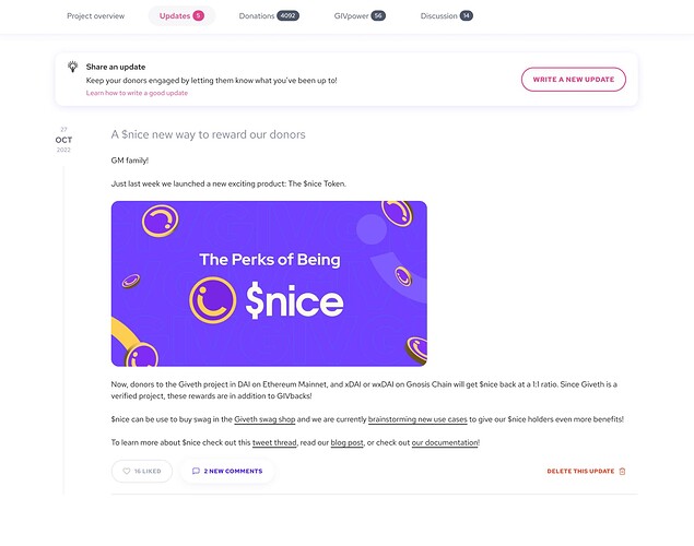
Improved update tab for project owners
Keeping project details up-to-date is essential for project owners to maintain a strong connection with their donors. By providing regular updates on their projects, owners can show donors how their donations are being utilized and keep their projects relevant for potential donors.
We understand that writing updates can sometimes be a daunting task, which is why we strive to create an improved user experience for project owners to encourage them to share more information about their projects.
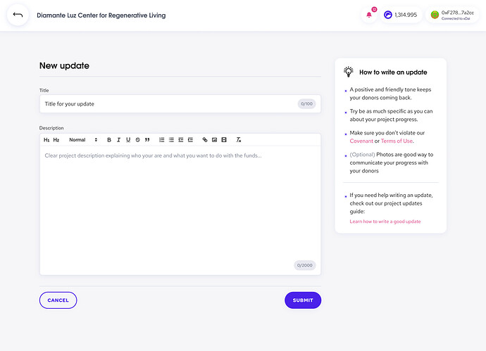
Here is the new and improved user experience to write a new update:
When project owners want to write a project update, they can simply click on the Write a new update button. This will take them to a new standalone page specifically designed for writing updates, without any distracting elements that may interfere with the writing process.
Replying to project update comments
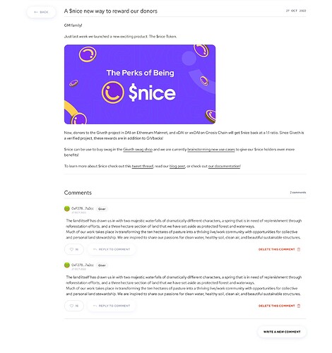
When it comes to replying to comments on project updates, only project owners have that ability!
We’ve made it as easy as possible for them to do so by adding a “Reply to comment” button. This allows project owners to easily write their response to donor comments.
Additionally, project owners have the ability to delete any inappropriate comments made on their project updates.
Our goal is to help project owners receive more attention and donations for their projects by providing them with the necessary tools to keep their donors engaged and informed. So, we always encourage project owners to write regular updates, and we’re committed to supporting them every step of the way.
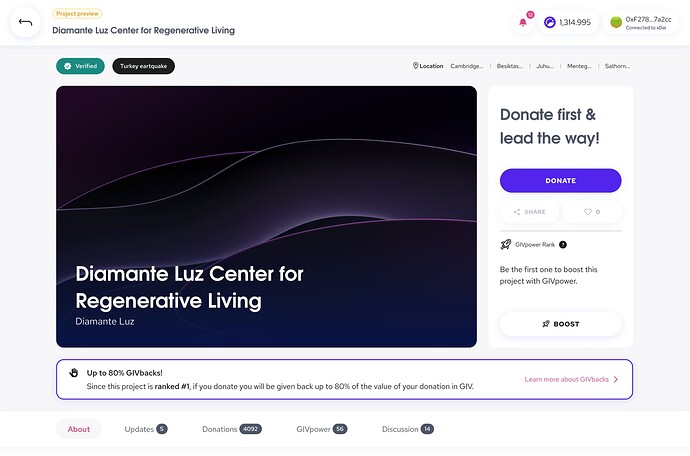
Project preview for project owners
We have also added a feature to make it easier for project owners to preview their projects.
By simply clicking on the Go to public view button, owners can easily enable the project preview and see how their project appears to donors.
This allows them to identify and fix any possible mistakes or issues.
Finally
The team welcomes feedback and thoughts on how to further improve these features.
Let us know your thoughts and suggestions for improving these features. We value your feedback and are committed to enhancing the user experience for project owners.
