Improving single project screen

What’s wrong with the single project screen!?

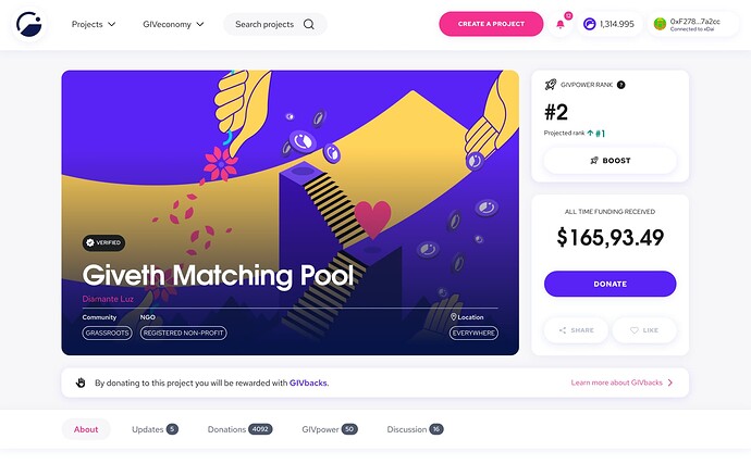
Please take a look at the current version ↓

We are trying to give more control over the project data to project creators and let other people find related information more easier and also make it easier for everyone to ** communicates with the project owner**
Also since we add GIVpower to this page too, we have to think about the whole structure again.

We also have some issues related to this topic that are worth checking them:

The solution

The very first change we need to make is making the single project screen structure cleaner so users can find different stuff easier.

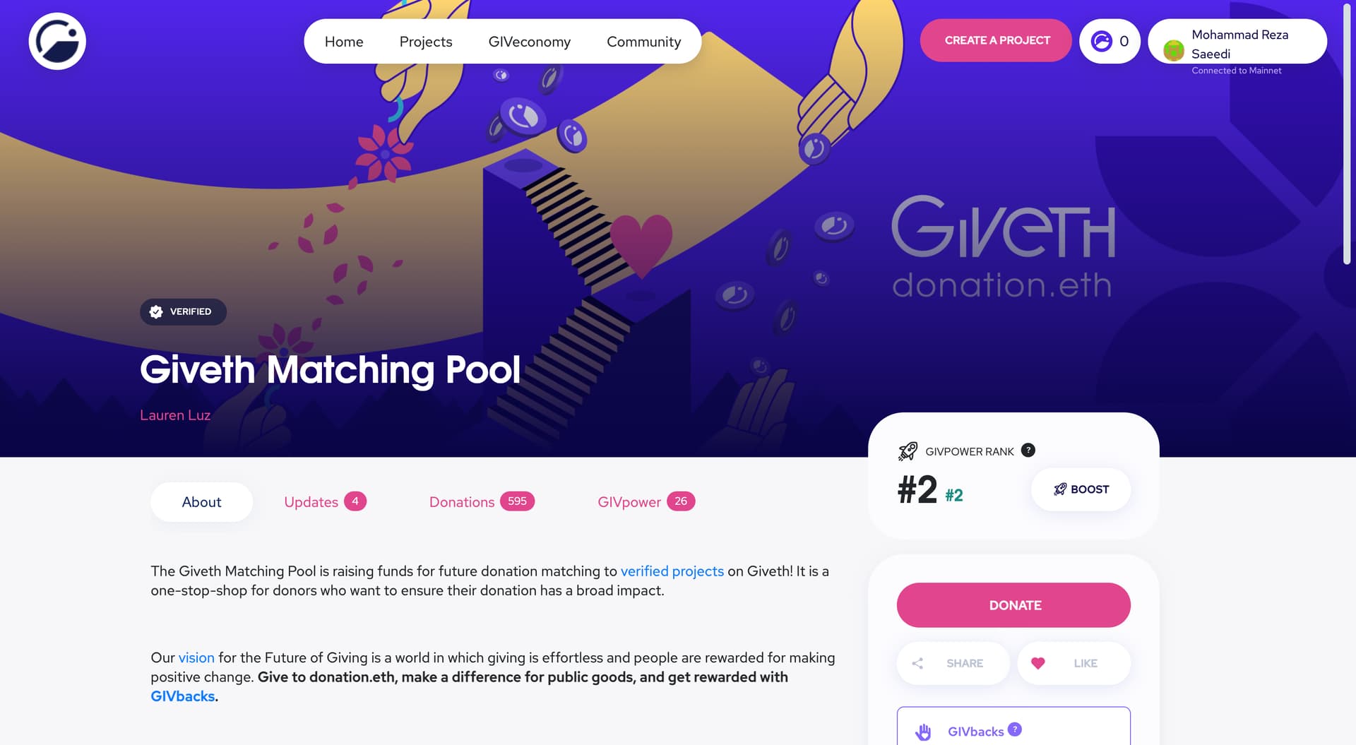
So in this new structure, instead of showing a full-width image on the top we will show a smaller image and on the right side, we can show the GIVpower and Donation card.
Also, the way that we were showing the project is eligible for GIVback was not prominent enough and now we can clearly show that the project is eligible for GIVback and even let new users learn more about the idea behind the GIVbacks.

Then after the top section, the user can see all of the tabs to find related information about the project.

Single project body

The very first change on the project body is, now we will use 100% of the screen to show the content and the donation card will not show up on the right side, instead when the user scrolls down, the donate button will appear in the right side of the tabs on the top.


Tabs

We made some changes to the tabs and also added a new tab! scroll further to read more about each of them.

About project

Under the about tab now we will have sub-sections and the project owner can add info in this new structure so the donors and people who are interested in the project can find all information about the project more easily.
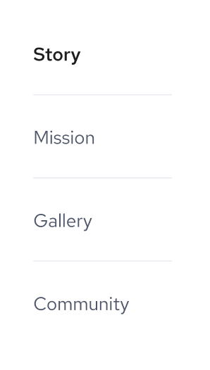
The Story
The project owner can share the whole story behind the project.

The Mission
What are the mission and core values of this project!? they will be answered here.
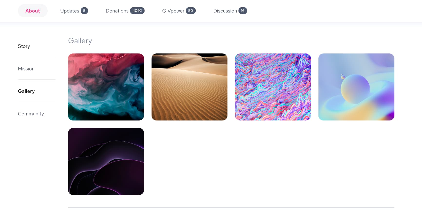
The Gallery
A space for the project owners to add as many pictures as they want about the project.
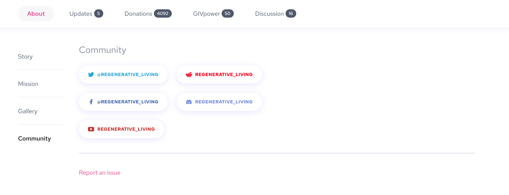
The Community
Visitors can find all of the social networks related to this project here and get more involved with the project.

Updates tab

We still have the familiar look on this tab with some improvements and two new features!
Now there is more space to show the project update, and also users can Like or comment on each update.

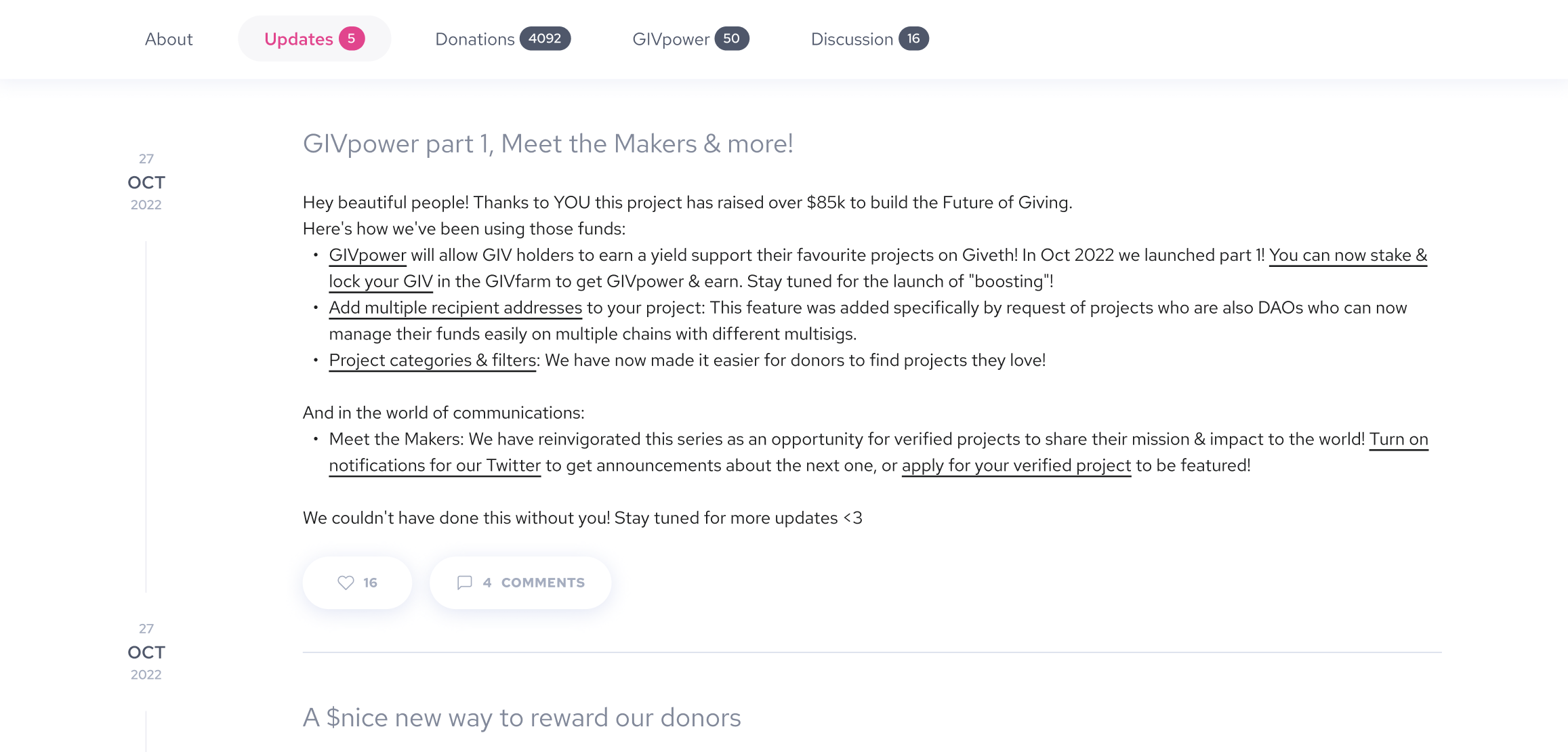
Users can tap on the Comments button to see all comments for each update.

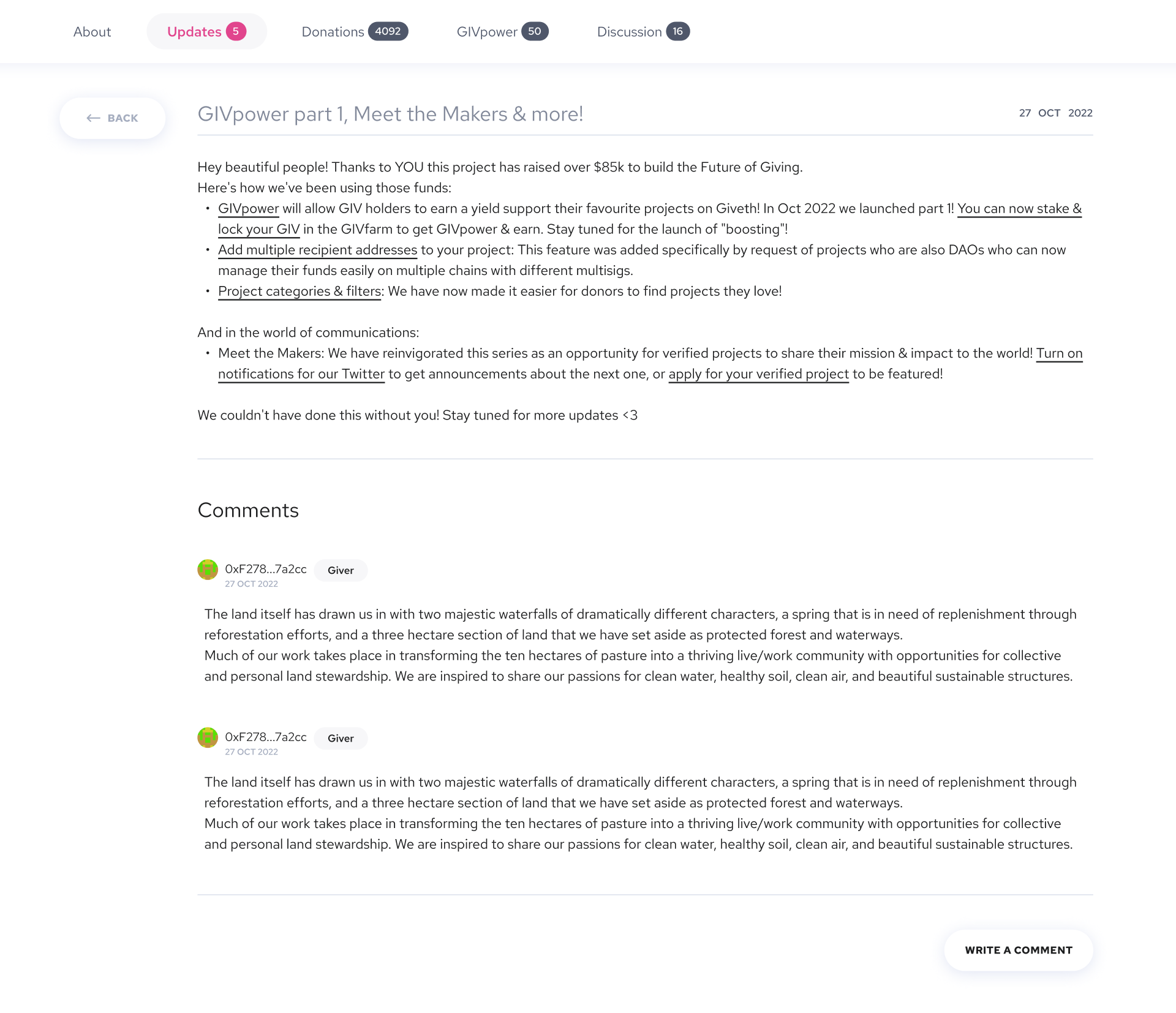
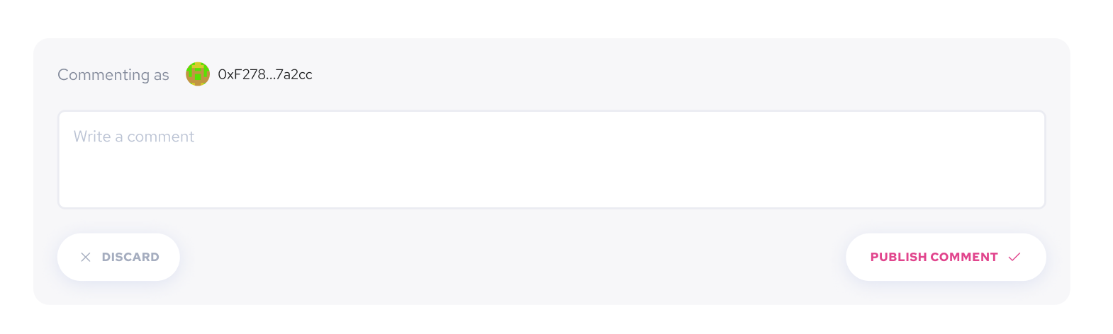
Here, user can tap on Write a comment to activate the editor and write a comment

Question for you!

Do you think we only need to let Donors and people who boost the project be able to write a comment or it should be available to anyone to comment on project updates?
Please share your thoughts in the comments!
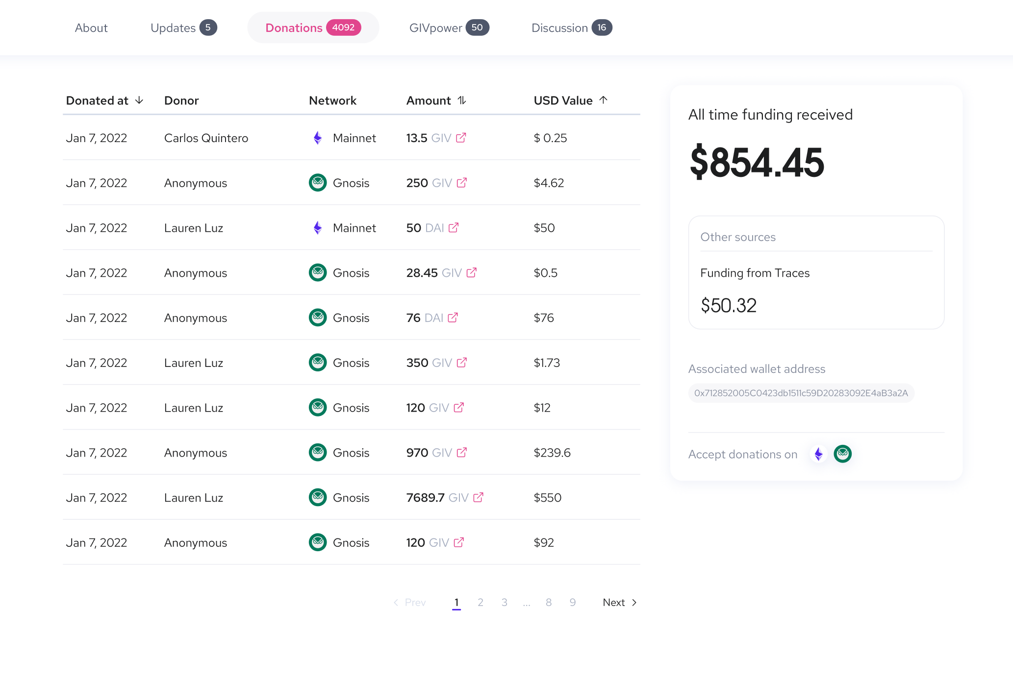

Donations tab

The donations table is the same as what we have now, only the way we are showing all donations changed a bit to be easier for users to understand.


GIVpower tab

The same thing happened here like the donations tab, the overall GIVpower info is visible on the right side!
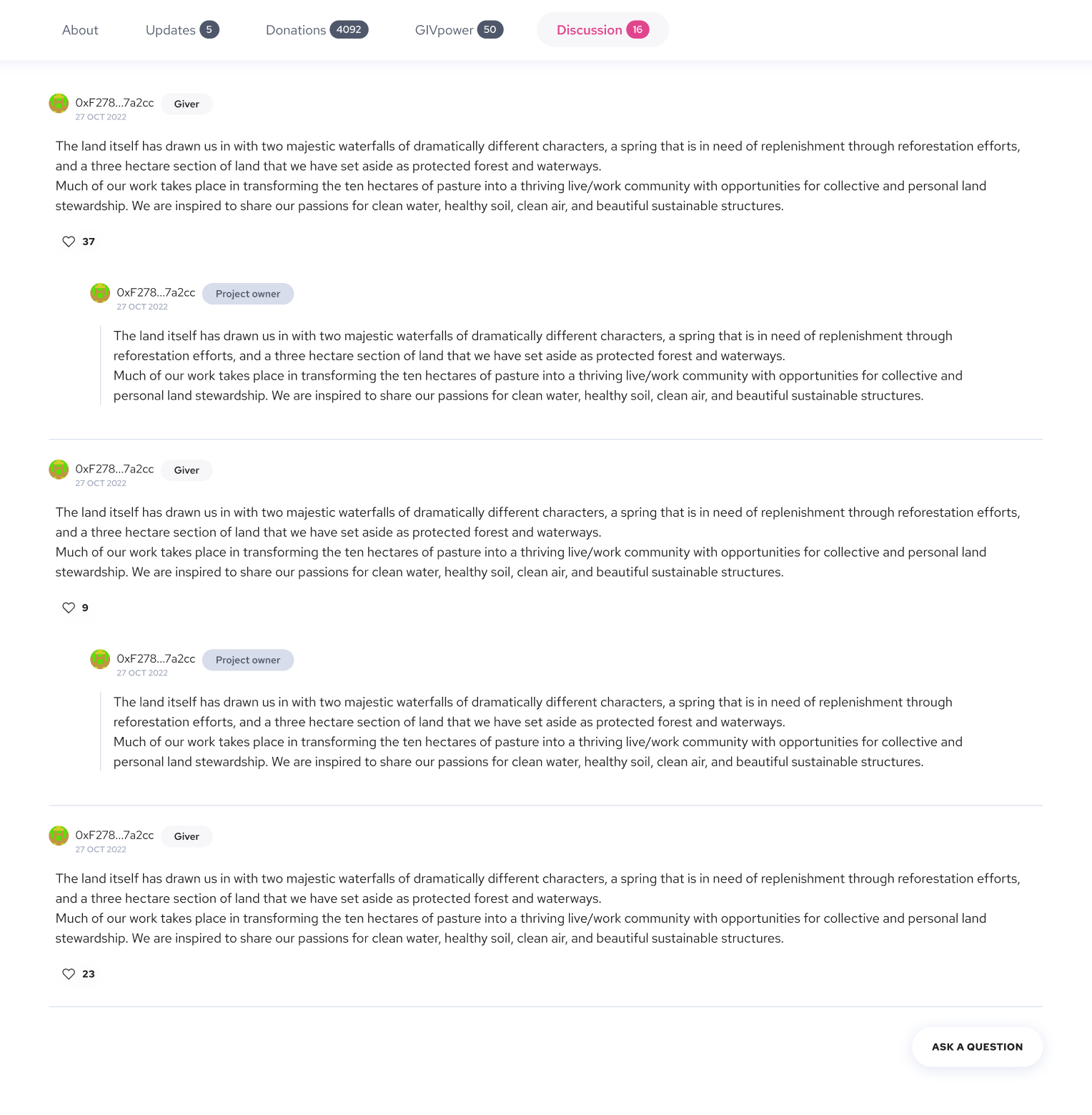

Discussion tab

This is the new tab we are adding to the single project screen.

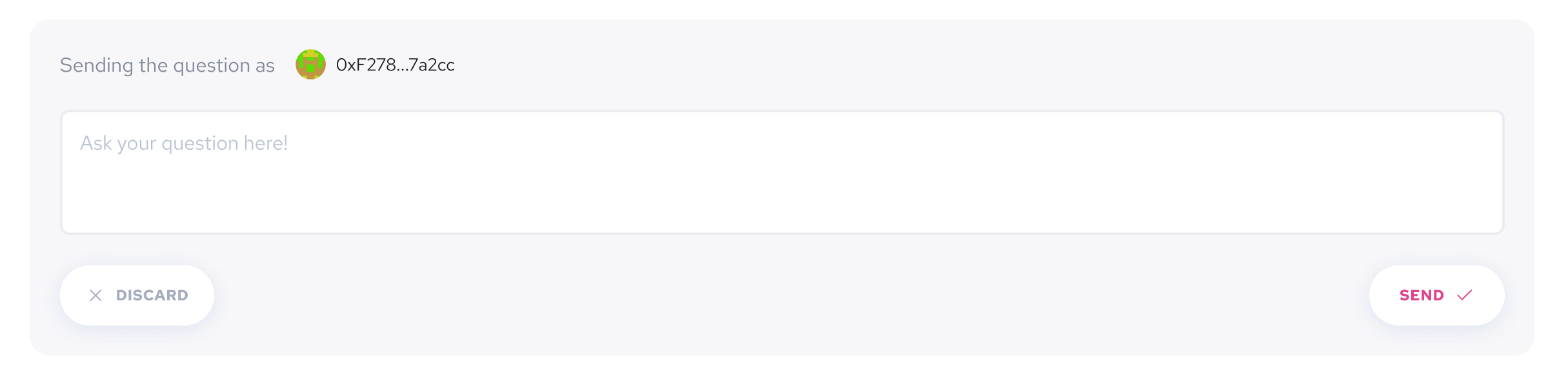
This tab can be used for anyone who has any questions regarding the project! they can ask their questions and the project owner can answer those questions.

Users can tap on Ask a Question button and write the question and later, the project owner can answer.

That’s it

So what do you think about this restructuring? What do you think is missing to improve? How we can make this better?

Please share your thoughts and feedback in the comments.

Thanks

10 Likes

THIS IS AMAZING!!!

Wow this has so many cool features for projects and donors I love it!

A few things:

  • On the main page - it seems like there is a lot of padding on the left and right sides. I think the cards for GIVpower and Donation are a bit too big. What does the all-time donation amount look/feel like when the number is really low? Will it seem embarrassing to the project…

  • Also on this page: Is there any space to have promotional banners or other things to highlight for donors to projects? i.e. how we have a special banner for the Giveth project to promote the $nice token.

image


For the tabs on the left hand side of the screen - is there a way to make it customizable? Can a project owner select which tabs they want to add? maybe they only want story and gallery or mission and community or some other combination.

On that topic as well, what other fields might users want? What are some ways they will want to divide up their project’s information?

Also for power users - it would be awesome if the text fields would have better support for Markdown/HTML - maybe this is a technical thing

7 Likes

Loved the proposal. As a project owner of Urbanika, I really appreciate the following:
-Ways to interact with donors, such as the Ask a question, and the reactions and commentaries from the updates.
-Subsections! that will make it easier to divide info.
Within these subsections I suggest to have a way to show the theory of change of a project. I was inspired to create Urbánika’s one from a Giveth post, so it would be great if we could show it, also is a way to keep accountable.
On this same line, the metrics and how we are advancing on them, would be great for both donors and project owners.

For donors, it is an accountability feature. What have done with my support? tangible and not lost in the updates section.

For project owners we are nudged to professionalize, and upskill to show our progress towards the future we are building. This should be optional to show, as there might be projects that may not have metrics to show -such as one time campaigns.

Following the metrics point, it comes to my mind the need for a progress bar on the budget we are asking, so a subsection of budget would enable donors to know how much it is needed, and how far away is the project to getting it. This can be used as a marketing campaign for project owners to ask: “hey we are $300 away from our goal, pls support us!”

Returning to the updates section… It is very weird. The other day it took me like 30 min to post an update because it was asking me to shorten it down, until it didn’t make much sense to share the message. I passed from being hyped about sharing the news to being bored and frustrared on the length and format…
Also it was taking like 100 chars away from just hitting ENTER (going into another line).

Ok.

If I may, I would like to suggest having the option to display the campaign in at least two different languages.

Well, getting back to your original proposal.

Only donors. Why? I’ve had local businesses that appear in Google Maps. It happened to me that on the first day of launching I received a commentary of a person saying that the sandwich was terrible…
We didn’t even inaugurate the place when that commentary arrived. And also, Anna received a threat of an Indian dev saying he will put 10000 bots giving bad commentaries and bad rankings to the company she was working on if they didn’t pay $XXXX by the next day.

I think you understand the point. Donating is a spam filter.

Thanks for the incredible proposal. Looking forward to seeing it live.
Best wishes, Giveth fam.

7 Likes

Just had another thought - since we are considering adding in more places for user content we should think about how we’re able to catch malicious or spam comments - even from donors.

From a development perspective we will need some sort of spam protection - like message timeouts. We also talked about this a while ago, I wanted to bring it back so we keep it in mind:

From a design perspective we should think of how users/project owners might be able to flag or request to remove certain comments from discussions and updates

4 Likes

I really like this idea - having to stake something on leaving a comment / asking a question! What a great spam filter :slight_smile:

Wow wow WOW!!
I’m so delighted with all of this.
What is missing or can be better… THIS:

Project Description and Updates text editor is so 2000. I want to make it beautiful and rich with text formatting and image / video insertion but I end up frustrated with the limitations - what you see is NOT what you get and everytime I go back to edit it, my project disappears until someone can vet the changes and relist it.

4 Likes

Love this!

Re comments: would like to see the option to restrict to donors, but if it has to be one or the other I would say limiting to donors would help reduce spam. On this topic, the ability to moderate comments would be important.

Agree with Mitch on the ability to customize which tabs appear

for the questions tab, would like them to be hidden until the creator answers, otherwise you have the same issue as comments.

Also echo all the previous comments/concern around updates needing a review, supporting markdown, etc.

3 Likes

Thanks, Mitch for your feedback!

The design of this proposal is not final and we will update it and try to solve issues that we may find in this proposal.

Good point, I have to consider that too.

Good idea, it has a lot of value to the project owner too!

Yes, I think it should be up to the project owner, but we have to encourage them to fill in all of the tabs because they can help donors easily learn about the project.

Up for discussion!

Agree!

2 Likes

Thanks, @HBesso31 for your amazing feedback!

I’d love to jump on a call and talk more about this topic and see how we can create a better experience for all project owners.
I’ll try to reach out on Discord and set up a call for next week.

1 Like

Thanks, @Danibelle for your comment!
Since we are updating the project description page we actually need to update the create project page too and we will update that to 2023 as well :grin:

1 Like

Thanks @Maxwe11 For your feedback!
Yes, we will update the create project form as well!

@msaeedi This is all really great! Thanks, everybody!

Meanwhile, I’d just like to note something quite minor and potentially already flagged, but the comma is placed incorrectly on the funds raised of the new project screen.

Single project new look!

Nice work @msaeedi I love it!

A few comments I have:

  1. Can we allow projects to embed videos either by uploading a video or YouTube links? Maybe that can be an option for the gallery.

  2. Story and Mission seem too related. Maybe we can combine them into just the Mission field since usually the story is tied to the mission.

  3. Can we add an Impact tab as well? So projects can say what they accomplished. This is similar to the update tab, but wouldn’t necessarily be time-based but an overall thing they want to highlight (like we educated 1,500 kids and counting, dug 100 wells etc.)

1 Like

This looks amazing @msaeedi

& there is great feedback to get incorporated. I want to highlight a couple of things from my perspective:

  1. GIVbacks percentage on the projects page as discussed on this issue . But I see that you are already on top of it @msaeedi

  2. I’m not sure if the “community” tab is the best name… maybe connect

  3. Language toggle: We are a global platform, most projects located on non-English-speaking countries need to target both the local populations in their language and a larger audience in English at least or even more.

Hey folks, I wanted to come back around on this awesome feature update! Given our recent discussions around generating revenue and demand for $GIV tokens I wanted to propose some modifications into not this feature itself but how we implement it.

Building on this idea I proposed back in October:

The just of what I quoted above was that if implemented a feature where we required projects to make a deposit in $GIV in order for them to create a project on Giveth.

There were many fair arguments against this idea, the primary being creating friction for people to use our platform and simply just make a project.

But What If…

So perhaps overcoming this we could create a “basic” version of the project view - which is the current version and then a “pro” version that would include all of the features that @msaeedi has designed for us.


Users would need to deposit a certain amount of GIV, which might change periodically based on factors such as average 30 day price and they would be able to upgrade their project with additional features.

Users can retire their project or downgrade it to the basic version and withdraw their deposit back with no fees or very little fees.

By doing this we can achieve a few cool things:

  • Design a “freemium” model that’s been adopted by many successful products.
  • Increase $GIV utility by requiring projects to acquire and hold GIV as long as they want their upgraded project features.
  • Don’t increase the friction for users who simply want to make a project but we offer them a better project owner experience for “just a few bucks” more.

I think we could design this feature independently to the current development process for the project single screen making a few extra modals for project owners, some extra database work and a deposit smart contract which would handle holding $GIV tokens.

We can launch the new single project screen view when it’s ready as an “Open Beta” while we prepare the rest of this feature in the meantime.

WDYT?

2 Likes

Oooooo premium features!

The freemium model is always nice. And I really love this proposal.

We could just require them to have staked (not locked?) tokens in their project’s gnosis address.

I think staking $100 to $500 is the range i would like to see… they still earn rewards too.

1 Like

That’s cool - we wouldn’t need to add any smart contract work, just maybe a sub-graph query to keep track of their staked amount.

2 Likes