This forum is a complementary post for this proposal → Improving single project screen
We started by giving the single project detail screen a facelift but quickly realized we couldn’t stop there. We didn’t hesitate to roll up our sleeves and dive headfirst into fixing and enhancing numerous other areas. We have much to show off and eagerly await your thoughts!
So, what was the issue?
The project detail screen was becoming increasingly complex, with new elements being introduced, such as:
- GIVpower ranking
- Additional information to inform users about the GIVbacks
- Up to five possible locations for a project
- The ability for users to leave comments on updates
- Project discussion to facilitate communication between the project owner and donors
Unfortunately, the current design cannot accommodate all of these elements. That’s why we overhauled the project details to make it possible to support these new features.
I divide everything into two parts:
- Donor’s side
- Project owner’s space
Donor’s side
The project detail consists of two sections: the intro area and the content area(Tabs).
The intro section
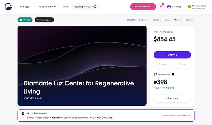
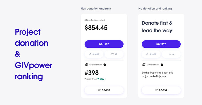
We’ve made some amazing changes to the intro section of the project detail screen. These updates include reorganizing information to make it easier for users to read and understand and clearly display the total amount of donations the project has received.
We have also designed a better space for presenting the project banner, with the tags and locations rows at the top and the Givback reward percentage at the bottom.
These changes enhance the user experience and provide more transparency around the project’s progress toward its funding goal. We believe these improvements will significantly benefit our users.
The content section
Now let’s talk about the content area!
About tab
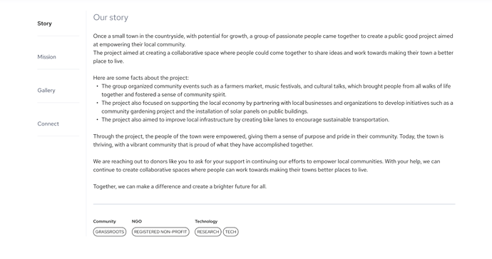
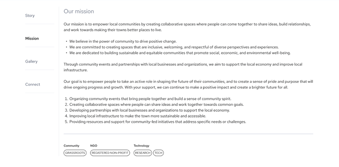
The About tab now has four sub-tab; story, mission, gallery, and connect.
The project owner can now divide the project detail into separate tabs to make it easier for the donors to read the information and find different data more effortlessly than before.
The story tab can contain the story behind the project.
The mission tab contains the core value and mission of a project.
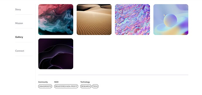
The project owners can use the gallery to share different media, like images and videos, with donors.
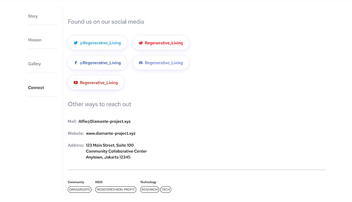
And finally, on the connect tab, the project owner can list all sorts of links to social media, addresses, emails and.
The story
The mission
The gallery
Connect
Update tab
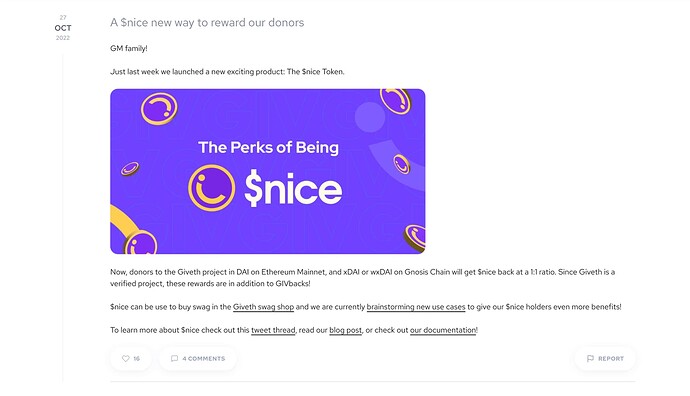
We’ve added a comment section to the project updates, meaning users can now share their thoughts, feedback, and support for the projects they care about.
By allowing donors to leave comments on project updates, we’re providing a simple yet powerful way to enhance the sense of community on the platform and encourage more meaningful interactions between donors and project owners.
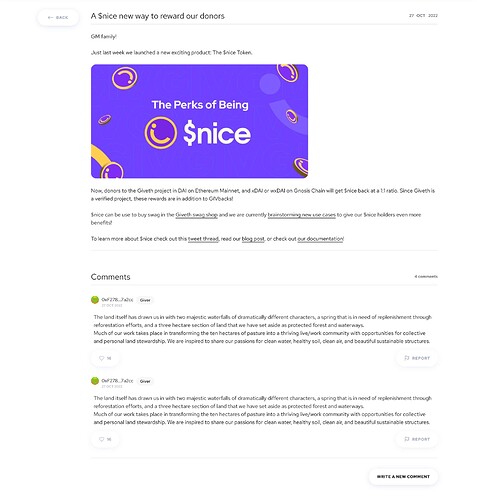
With the comment section, donors can ask questions, provide feedback, or express excitement about a project’s progress. Project owners can respond directly to these comments, creating a more personal and engaging experience for everyone involved.
You can find the comments button after the likes button.
By tapping on Write a new comment, donors can write a new comment for the project update.
Donations tab
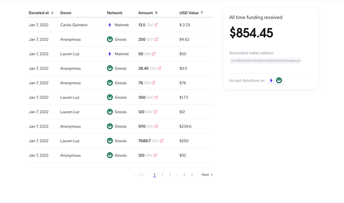
We’ve added a new card to the donation tab that displays the total donations a project has received, and the chain networks donors can use.
These updates improve transparency and the donation process.
Givpower tab
We created the GIVpower feature, allowing users to increase their favorite projects’ visibility and impact.
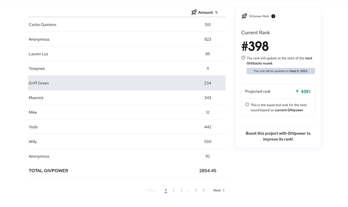
However, we know that understanding the ins and outs of GIVpower can be a bit daunting. That’s why we added a new card to the GIVpower tab that explains everything in simple, easy-to-understand terms. This card provides users with a clear explanation of the current and projected GIVpower ranks. We hope this new feature will encourage more users to get involved with GIVpower and help support the amazing projects on our platform.
Discussion tab
Introducing our latest addition to the project detail page - the Discussion Tab!
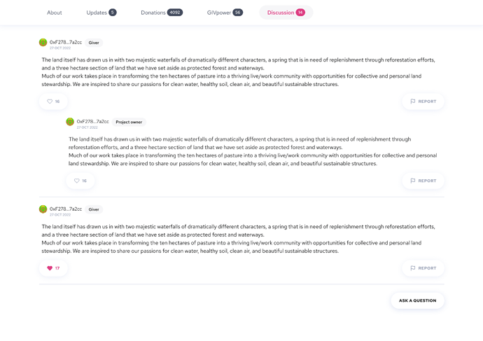
The new discussion tab is a valuable addition to the project detail page. It allows all users, donors or not, to connect with project owners and ask any questions they may have. While only donors can answer, the discussion tab provides a platform for potential donors to engage with project owners and gain a deeper understanding of the project.
By facilitating this two-way communication, the discussion tab can help project owners build meaningful connections with donors and foster a stronger sense of community around their project. We believe this feature will be a powerful tool in advancing our mission of creating a more transparent and collaborative funding ecosystem.
A ChatGPT summary for those who didn’t go through everything individually! ![]()
In summary,
the single project detail screen was becoming increasingly complex.
The current design could not accommodate all the new features being introduced, including GIVpower ranking, additional information to inform users about the GIVbacks, multiple project locations, users’ ability to leave comments on updates, and project discussion to facilitate communication between the project owner and donors.
To address this issue, the design team divided the project detail into two parts, the donor’s side and the project owner’s space. They made some amazing changes to the intro section of the project detail screen, reorganizing information to make it easier for users to read and understand and clearly displaying the total amount of donations the project has received.
They also designed a better space for presenting the project banner, with the tags and locations rows at the top and the Givback reward percentage at the bottom.
The content area has also been improved, with the About tab now having four sub-tabs: story, mission, gallery, and connect.
The update tab now has a comment section, allowing donors to leave comments on project updates, providing a simple yet powerful way to enhance the sense of community on the platform and encouraging more meaningful interactions between donors and project owners.
The design team has also added a new card to the donation tab that displays the total donations a project has received, and the chain networks donors can use.
Finally,
The design team eagerly awaits feedback on these improvements.
